Posts tagged "infographic"

Word Clouds Show What It’s Like to Be on Drugs
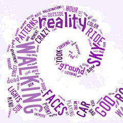
What does the language of drug experience look like? What words do we turn to again and again to describe an LSD trip or a cannabis high? Rehabs.com has created some slick graphics to answer these questions (although they are not the first). They performed “extensive linguistic analysis on thousands of written user experiences” drawn from the Erowid database. The graphics cover eight popular drugs, including LSD, DMT, MDMA, and mushrooms. The words shown are the ones most unique to each particular drug, and the size of each word indicates its frequency in user reports. One major problem with an...

New Interactive Graphs Visualize Online Drug Talk
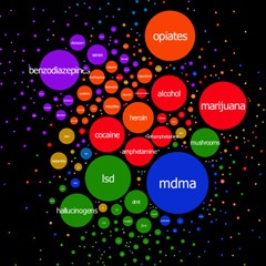
On his blog Virostatiq, Marko Plahuta has published a set of colorful interactive graphs depicting drug discussions on Bluelight.ru, the harm reduction forum. According to Marko: I analyzed around 1.2 million posts on bluelight.ru and constructed a simple diagram that tells a lot. It was constructed in such a way that drugs that are frequently mentioned together, appear together. Circle radii are proportional with frequency of appearance of the same drugs in the posts. A second graph maps the relationships between drugs and effects commonly reported in user posts. The source data covers a period from 2010 to 2013,...

