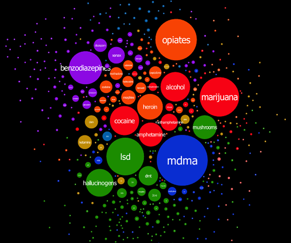
On his blog Virostatiq, Marko Plahuta has published a set of colorful interactive graphs depicting drug discussions on Bluelight.ru, the harm reduction forum. According to Marko:
I analyzed around 1.2 million posts on bluelight.ru and constructed a simple diagram that tells a lot. It was constructed in such a way that drugs that are frequently mentioned together, appear together. Circle radii are proportional with frequency of appearance of the same drugs in the posts.
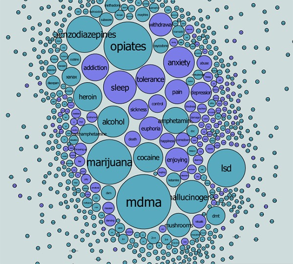
A second graph maps the relationships between drugs and effects commonly reported in user posts.
The source data covers a period from 2010 to 2013, so he is also able to provide an interactive historical graph showing the changes in popularity of different drugs. With this graph it’s easy to see how discussion wanes when a chemical is outlawed, and how a new compound like 25I-NBOME becomes a hot topic shortly after its discovery.
Liked this post? Subscribe to my RSS feed to get much more!

